Showing posts with label illustration. Show all posts

Wednesday, 13 August 2014

It's a Stick UP!

Original Post: http://www.cassfashion.co.uk/stick/

So what exactly is it that makes the sticker so alluring to the creative type? You see an influx of creative’s in a specific area, because of cheap rent and large spaces or whatever it may be, and you will inevitably see the clean street signs alongside pretty much any flat surface, become collaged with a myriad of adhesive backed printed paper and vinyl.
Street stickers have obviously been around for way longer than I have even been alive, so I’m not going to sit here for starters and claim to be some kind of sticker bombing assassin, but more just explore the idea a little and look into how it all started and how it developed. I find it quite interesting and hopefully at least one other person who is remotely interested in street art, skate culture or design will too!
 So I’m going to begin with Shepard Fairey. It seems that almost everybody on the planet is aware of Shepard’s work, even if they don’t know about the whole Andre the Giant revolution they would definitely recognise the Obey logo. Shepard explained in his book ‘Supply & Demand’ that as a youngster with an interest in punk rock and skateboarding he found the occasional sticker sighting as ‘an encouraging sign that there were more dedicated proponents of punk and skate culture lurking in the city. Stickers were a sign that I wasn’t living in a total void. I wanted stickers as badges of my culture.’
 Stickers can give you a feeling of belonging and allow you to share or even force your interests and the type of stuff that you like onto other people, especially in aspects to graphics related to punk rock and skate culture, which is something that is still not completely socially acceptable, even though it is becoming a lot more commercial. Plastering the front of your shiny new nondescript branded laptop or whatever personal effects with an awesome collage of stickers suddenly differentiates your stuff from all the millions of people who have that exact same one, it also looks totally awesome and makes you feel pretty cool, individual and slightly rebellious.
Going back to the Obey stickers here is Shepard fairey’s Obey ‘manifesto’.
Have a read, its really interesting stuff.
A nonsensical visual pleasure or an underground cult? I urge you to go buy Shepard’s book, or do a good bit of research on the internet (theres a number of really interesting documentary’s about Shepards work) because theres so much more interesting stuff in relation to Obey that I can’t even begin to cover in one blog post and then you can make up your own mind!

Manifesto

“The OBEY sticker campaign can be explained as an experiment in Phenomenology. Heidegger describes Phenomenology as “the process of letting things manifest themselves.” Phenomenology attempts to enable people to see clearly something that is right before their eyes but obscured; things that are so taken for granted that they are muted by abstract observation.
The FIRST AIM OF PHENOMENOLOGY is to reawaken a sense of wonder about one’s environment. The OBEY sticker attempts to stimulate curiosity and bring people to question both the sticker and their relationship with their surroundings. Because people are not used to seeing advertisements or propaganda for which the product or motive is not obvious, frequent and novel encounters with the sticker provoke thought and possible frustration, nevertheless revitalizing the viewer’s perception and attention to detail. The sticker has no meaning but exists only to cause people to react, to contemplate and search for meaning in the sticker. Because OBEY has no actual meaning, the various reactions and interpretations of those who view it reflect their personality and the nature of their sensibilities.
Many people who are familiar with the sticker find the image itself amusing, recognizing it as nonsensical, and are able to derive straightforward visual pleasure without burdening themselves with an explanation. The PARANOID OR CONSERVATIVE VIEWER however may be confused by the sticker’s persistent presence and condemn it as an underground cult with subversive intentions. Many stickers have been peeled down by people who were annoyed by them, considering them an eye sore and an act of petty vandalism, which is ironic considering the number of commercial graphic images everyone in American society is assaulted with daily.
Another phenomenon the sticker has brought to light is the trendy and CONSPICUOUSLY CONSUMPTIVE nature of many members of society. For those who have been surrounded by the sticker, its familiarity and cultural resonance is comforting and owning a sticker provides a souvenir or keepsake, a memento. People have often demanded the sticker merely because they have seen it everywhere and possessing a sticker provides a sense of belonging. The Giant sticker seems mostly to be embraced by those who are (or at least want to seem to be) rebellious. Even though these people may not know the meaning of the sticker, they enjoy its slightly disruptive underground quality and wish to contribute to the furthering of its humorous and absurd presence which seems to somehow be antiestablishment/societal convention. Giant stickers are both embraced and rejected, the reason behind which, upon examination reflects the psyche of the viewer. Whether the reaction be positive or negative, the stickers existence is worthy as long as it causes people to consider the details and meanings of their surroundings. In the name of fun and observation.”
Shepard Fairey, 1990, WWW.OBEYGIANT.COM (go check it out!)


All images used are Copyright© 1989 - 2014. All Rights Reserved by OBEY GIANT.

Friday, 7 December 2012

Jesse Auersalo | Meticulous Rendering


Here is an introduction to the illustrative world of Jesse Auersalo.
I was introduced to his work thanks to the December issue of Juztapoz, who described his work as 'often dark and intimidating but the attention to detail and meticulous rendering contrast to create strong iconic imagery that can shock and fascinate in equal measure.'

I do love a good bit of controversial art, so these illustration are just up my street. I love the lack of (with exception to the blue haired figures below) colour, and the lack of expression.
I am pretty sure that if these illustrations had been created around 1914, Jesse would have ended up in the same cell as Egon Schiele.


If you love Jesse's illustrations enough you can even buy a t-shirt from here, 

http://www.sixpack.fr/shop/femme/908-candle-tee-shirt.html


Sunday, 11 November 2012

Eroné.

As a result of the Street Sketchbook book by Tristan Manco I mentioned in my last post,
I was introduced to the work of Eroné.
I have used some of his illustrations as an inspiration point in my sketchbook, which is still at the minute a collection of things that I like and find inspiring.
Yet maintaining some form of relation to my project, it should all hopefully come together and make some sort of sense.
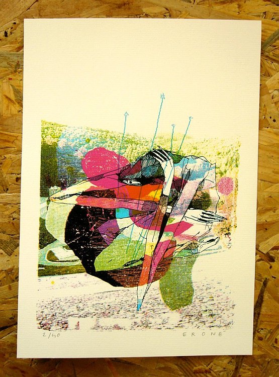
Eroné is a French illustrator who 'likes to draw with a free spirit' and his work is described as a 'responce to human emotions, attitudes and movements'.
I find the way he deals with the human figure incredibly interesting,,,,,
all these images have been taken from his website, http://erone.grphk.free.fr/
which you should also have a look at.

The form and detail are both incredible, the colours and textures are also so beautiful! 
I also like how the photos of the prints have been taken on such interesting backgrounds,,,


Sunday, 4 November 2012

Dennis Pomales | Humanish.


Heres a post type I have been slacking, as my blog has become increasingly self indulgent. 
I was searching for some illustrations that showed the human body (or at least 'humanish') in angular shapes, preferably triangles, for the project I'm working on, which I have shared with you on a previous post (and another new post soon to come!). And came across some awesome colourfull illustrations by Dennis Pomales, I decided to have a look on his website and came across this wicked sketches. 
They are incredibly quirky, and should be printed on t-shirts asap.

If you want to see more head over to his website -> http://www.minotaurelab.com 
 and,,,,,,,,,,, he also has his own blog.  http://minotaurelaboratories.blogspot.co.uk/


Sunday, 6 May 2012

LULU

Completely scraped my original idea for a silk scarf and now focusing on a story about myself.
our brief was to either do a person place or event. 
Since a young age I have been obsessed with carousels and rocking horses
and felt to do a story about this.


First drawing for the project 


LULU- from my parents 1995